Best Practices
The more you develop custom components for Makeswift, the more you’ll get the hang of the most effective techniques for reliable and maintainable building blocks. In this section, you’ll get a head start on the most important practices to keep in mind.
React Best Practices
If you’re already an experienced React developer, you’ll likely be familiar with the best practices discussed here. If you’re just getting your feet wet with the technology as you dive into Makeswift, then these are some of the most critical concepts to learn.
React itself is a huge topic. You should thoroughly review React’s learning guide if you’re new to it.
Using State Appropriately
If you’re new to React, the use of state can be one of its trickier aspects.
State values don’t change until the next render
The value a particular piece of state when your component logic runs is like a snapshot. Updating the state queues a new value and triggers a re-render. This means that you shouldn’t expect state to reflect its changed value in the same context in which you change it.
The alert in the code above will reflect the value count has before it is incremented, not after. This needs a simple tweak to capture the new value in a separate variable:
For the same reason, you shouldn’t attempt to change a state value multiple times in the same context.
Don’t use state when re-rendering isn’t necessary
Updating a state value always causes the entire component to be re-rendered. It’s inefficient to render components repeatedly when their final output doesn’t actually need to change.
If you have a value your component needs to “remember,” but it’s not important that the component be re-rendered when it changes, use a ref instead.
Using State and Props Together
Sometimes you may have scenarios in which it seems appropriate to make state dependent on a prop. Failing to understand how the two work differently will lead to unexpected results, especially in the Makeswift editor when changing values with your props’ controls.
The following hypothetical component assumes we have a Makeswift control for setting what the “light mode” and “dark mode” text colors will be. Which mode is being rendered (and therefore which color is used) is an interactive value the end user can toggle.
In the Makeswift editor, we’ll find that when we update the values of lightColor and darkColor, the change will not be immediate. The current state of _textColor_is remembered and only changes in response to the user interaction that toggles between “light mode” and “dark mode,” not in response to new prop values.
The most straightforward fix is to use an effect to also make a state change dependent on the prop:
However, a better solution would be to compute text color from both props and state:
Makeswift Best Practices
Don’t Overcomplicate Props
If you find yourself adding a very large number of prop controls to a component - especially if they largely represent colors, text, and formatting options - take a step back to consider whether you can simplify your approach.
A Slot prop to allow authors free-form control over pieces of content can often be a better choice than a long, rigid list of fields.
Slot also enables another strategy for decreasing the complexity of your props: Splitting your presentation into multiple smaller components. A monolithic component with a lot of layout elements and props for each might work better with a few strategically placed Slots and companion components to populate them with. Both parent and child components become more versatile and reusable in the process.
Custom Components Only When Needed
Perhaps the most important impulse to “un-learn” when it comes to Makeswift is the inclination to create a custom component for a complex content presentation that can be built purely in the editor.
The ability to easily create sophisticated layouts without relying on code is the greatest strength of the Makeswift editor, so make sure you’re letting it do its job for your content authors! The most common valid reasons for building a custom component are the need for unique interactivity, unique state management and dynamic data integration. By contrast, a custom component that simply wraps a static layout can often be reconsidered.
This principle can be practiced with individual elements of your components as well. As an example, you might often be quick to make a heading part of the overall design of a component.
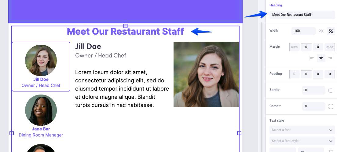
This is almost certainly unnecessary. Your content authors can drag in and format heading text (or not) without the need for incorporating it directly into the component and cluttering that component with more prop controls.