Component Controls
Introduction
Since the connection between props and controls is the glue that joins your components with Makeswift, effectively building components requires a good understanding of the available control types - their schema, how they operate in the editor interface, and the shape of the props they produce.
As you’ve seen, controls are defined in the data passed to registerComponent.
The props object in the component’s configuration contains each control, associated with the corresponding component prop by the object key. The title key in the above definition means the value configured with this control would be passed to the component with that name:
The value of each member of props is an instance of a control imported from the runtime package, and most of these expect a configuration object in their constructor, each with its own unique schema. The label field is common to almost all controls, defining the label that will appear in the builder’s property panel.
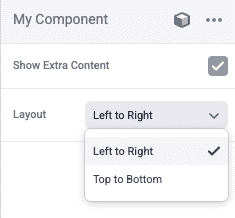
Here is an example containing two more types of controls (Checkbox and Select) with the configuration unique to each:
The UI for these properties in the builder is fairly predictable:
Instead of providing an exhaustive overview of all control types, we recommend referring to the comprehensive Makeswift documentation for detailed examples.
Below, we’ll explore a few of the more complex control types in more detail.
The Style Control
You’ve seen that Boxes in the Makeswift editor contain a number of properties for controlling key things like sizing, spacing, borders, etc. Any of your custom components can implement controls for these same visual aspects.
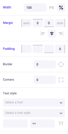
It appears as if these common attributes are implemented with multiple props/controls, but in fact this is done with only a single control of the Style type.
Notice the configuration for the Style control lacks a label, because this powers not just a single field in the properties panel with a custom label, but the full array of fields as you’ve seen above.
The implementation of a single control for all these visual attributes is easily facilitated by the utility class based pattern of Tailwind CSS, the styling framework used by Makeswift. The prop received by your component is a single string with all appropriate CSS class names and should be set on the root element in your component:
This implementation of the Style control will make these visual attributes editable not only via the properties panel but also with the interactive viewport controls you’ve already seen with Boxes.
In the control definition above, note the use of the Style.All constant to expose all possible style attributes. Other Style constants are available to restrict the styles that can be edited in the builder.
The RichText Control
The RichText control type defines a slot within your component where rich text is editable.
Unlike the TextInput control that simply exposes a field for simple text in the properties panel, RichText makes text directly editable within the layout in the editor canvas, along with all rich text capabilities. To facilitate this, the prop your component receives is not a string but a ReactNode, and where you render this prop in your JSX will directly determine the editor UI.
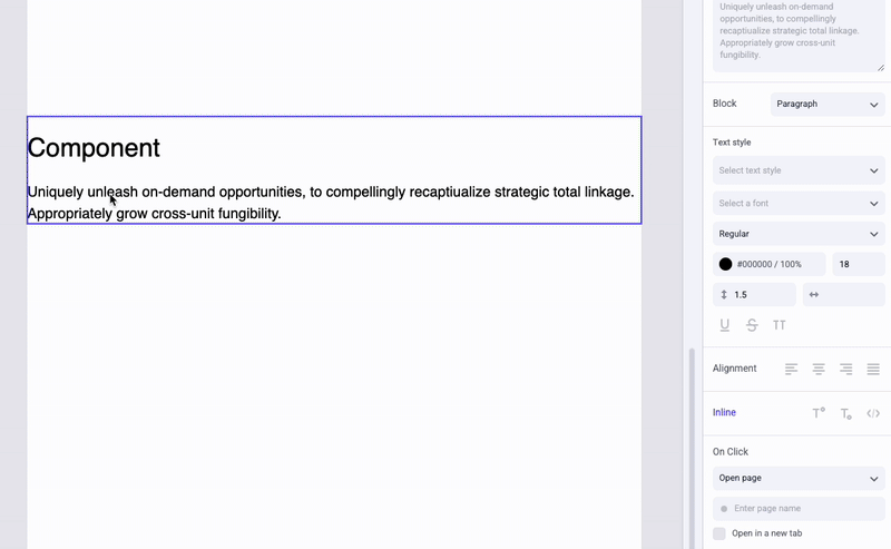
Note in the above that the property panel contains a number of fields for editing rich text, connected directly with the slot rendered in the component.
See the RichText documentation.
The Slot Control
Like RichText, the Slot control results not in a simple field in the properties panel, but an interactive area of the editor based on where the prop is rendered. In the case of Slot, the result is a zone where any other components can be dropped, arranged and configured, nesting them within the component in which the slot appears.
Registration example:
Note that Slot does not accept any configuration.
Like with RichText, the prop received is a ReactNode, and it is used in the same way.
With such a slot rendered in your component, free-form content can be authored directly within that component. This gives you the freedom to implement the interactions or presentation unique to your component structure without sacrificing the power of visual building of its content where appropriate.
Play the video below to see a brief example of how a slot works.
The Group Control
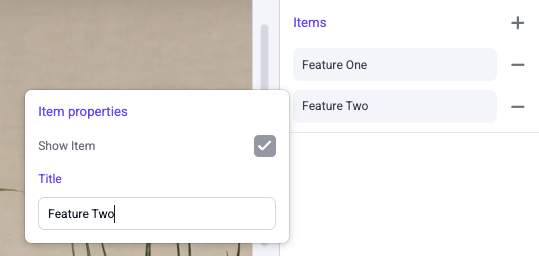
The Group control essentially allows you to nest other controls within a single complex value. This is particularly useful in combination with the Listcontrol, which allows configuring multiple values in the editor that are passed as an array prop. When used together, each item in a List can itself be a complex object supporting multiple fields.
RichText and Slot are valid controls to use within a Group, just like other control types. How you access and render the individual properties within your component (including how you render _each_such field from a List) will determine the corresponding interactive areas in the editor, as you’d expect.
Group controls can contain other Group controls, allowing nesting to any degree.
Note the getItemLabel function in the control definition. This is related to the List control and provides the representative label shown in the builder property panel for each item in the list. Accessing the individual properties of a Group object within this function is straightforward.