Using the Makeswift Editor
Introduction
The visual editor interface is the centerpiece of Makeswift, empowering marketers to easily design rich web experiences. While we are primarily concerned with approaching Makeswift as developers, understanding the fundamentals of the editor interface is essential in order to effectively architect custom components to enable the content creators you support.
You can learn the full details of the editor in the Makeswift Product Documentation. Below, we’ll cover the most important aspects of the editor.
Workspaces and Sites
Workspaces exist at the organization level and allow multiple users to collaborate. A workspace can contain multiple sites, and users can belong to multiple workspaces.
Easily switch between the workspaces you have access to, and the sites within them, with the main switcher in the upper left of the editor interface.
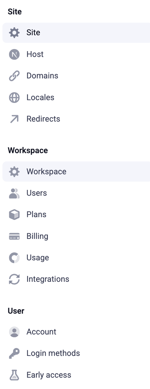
The editor Settings menu allows you to manage both settings for the selected workspace, such as users and billing information, and settings for the selected site, such as host details and redirects.
Built-In Components
The editor comes with a number of built-in components for constructing common content presentations of all kinds. The following primitives available in the component toolbar are the key built-in components that can be combined to create virtually any static visual layout:
- Box
- Text
- Image
- Button
Boxes, in particular, are crucial for creating content layouts. These are containers allowing the arrangement of other nested components, including other boxes, into complex structures. Boxes come with properties for adjusting the spacing between their children, and clicking on the grid lines between each component within a box will easily switch horizontal breaks between those components to vertical breaks and vice versa.
Play the video below to see a brief example of how boxes work.
Apart from these basic components, all other built-in components are available in the component drawer accessed with the ”+” icon in the toolbar.
Once an instance of a component has been dragged into place within the canvas, this instance is referred to as an element.
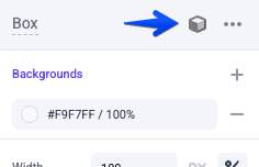
Component Properties
Properties are key to the functionality of components, allowing content authors to set important pieces of configuration affecting a component’s content or visual presentation. Each component type defines its own relevant properties, which are accessed in the editor side panel whenever a component is selected.
Boxes contain important properties controlling aspects like background, alignment, margin, padding, and borders. Any custom built-in components can easily implement these same properties as well. The key spacing and sizing properties can be set explicitly via the property panel or by interacting with the component visually.
Text components contain their own standard set of properties for configuring font, size, color, and other settings. Any RichText properties you implement on your own custom components will expose these same settings for formatting the text you enter.
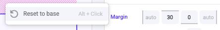
Any property can be reset back to its default by clicking on its name in the property panel.
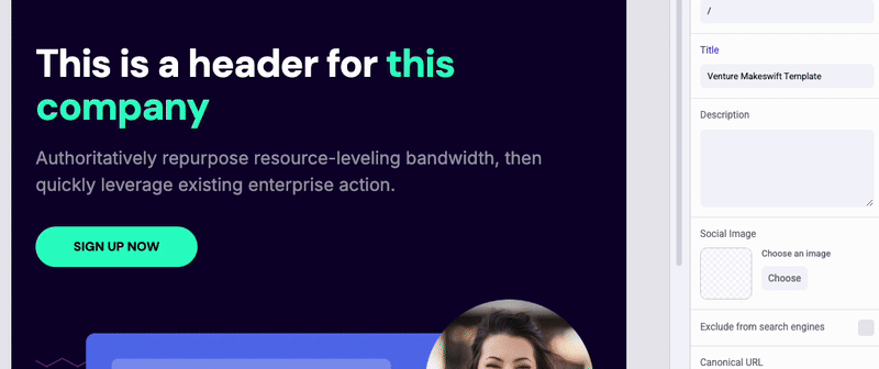
Page Properties
When no element is currently selected, the properties sidebar allows the configuration of page metadata, such as path, title, and sitemap priority.
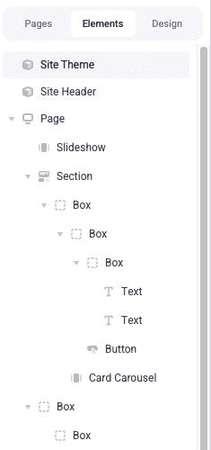
The Elements Panel
The Elements panel on the left-hand side of the editor displays a hierarchy of the current page’s elements, also providing an alternative way of selecting them instead of doing so directly in the canvas. This gives you the ability to select some elements that don’t visually appear on the page.
The Design Panel
The Design panel, located near the Elements panel, features properties including a global palette of colors and collection of text styles. These global styles control the available values for color and text properties in the editing interface. Editing these styles will take effect across all elements where you’ve used them in the editor.
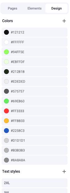
When editing a font family here or in any individual element, you can manage the selection of fonts available throughout the editor.
Editing by URL Path
In addition to selecting a page to edit from the Pages navigation, you can also directly edit the URL path in the editor’s location bar.
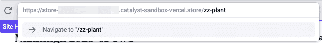
This will load the corresponding page into the editor and provides a method for editing even page routes that do not correspond explicitly with a Makeswift page in the navigation menu (if such a route features any editable components).
In Catalyst, for example, this feature allows for editing an individual product detail page by entering its unique URL path.
Global Components
The ability to store any component configuration as a globally available component gives content authors the power to design a layout and content structure of any complexity, then reuse this presentation across multiple pages and locations in the site.
Any component can be converted to a globally available component with a special control in the property panel.
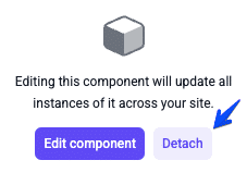
The component and its property values, content, and children will be saved into the site’s component drawer, which can then be inserted anywhere in the editor interface like any other component. When a global component is edited, these changes take effect wherever the component has been used.
Wherever a global component has been used, it can also be “detached” via the properties panel, decoupling the individual element from the component. Once this occurs, the element can be independently edited without affecting the original global component, and further changes to the component will likewise not affect the element. This means global components can be used effectively for a “template” pattern, creating reusable complex components to serve as common starting points and then filling in the unique content wherever they are used.
Catalyst Sample Components
When you create a Catalyst storefront and choose to include sample data, your site will include a number of pre-built global components for various use cases, ready to be used and detached in your layouts. These are located in the “Sections” group in the component drawer.
Responsive Configuration
A responsive switcher in the editing interface allows changing between different device breakpoints. (As you’ll see, the available breakpoints are determined in the Next.js application code where the Makeswift runtime is instantiated.)
Switching to a specific breakpoint will not only allow you to see an accurate representation of the page content at that size, but also makes it possible to custom-tailor key sizing properties and even selectively show or hide content only for that breakpoint.
Play the video below to see a brief example of how to override properties at smaller breakpoints.
Any property can be reset to inherit from the next highest breakpoint, in the same way properties are reset to their defaults.
Sharing and Publishing
All content and configuration changes you make in the visual editor are saved in real time, but you are in full control over when those edits are published to your public-facing frontend.
The controls near the location bar in the editor can be used to Share the non-published state of the current page or to Publish staged changes.
When publishing, you have granular control over which pages, global components, and site settings will be published to the live site.
Each Makeswift plan has a set limit on the number of publishes allowed per month. Rather than publishing every change to your content as you make it, plan a publishing schedule to utilize your allowed publishes effectively. Remember that a single publish can include any number of pages, components, and configuration values.
You can effectively use the editor’s Preview feature to view your updated content until you are ready to publish.
Try It Out
If you haven’t previously worked with the Makeswift editor interface, make sure to spend some time exploring its features, creating layout and content of your own, before continuing on. You’ll find that you’ll be much better equipped for designing custom components when you are well familiar with the concepts of the editor.
As an exercise, consider choosing a particular website whose presentation you like and attempting to reproduce a piece of layout and/or content from it with the Makeswift editor tools.
Remember to explore the Makeswift Help Center for details on even more features of the interface.