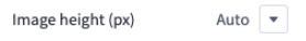
AdminWidgets & ScriptsInput ReferenceUI SettingsSelectCopy pageAllows you to display select controls for your widget. Widget Configuration Output { "imageHeight": "auto"} User Interface Output JSON Schema PropertyTypeDescriptionExampletypestringThe type of setting component to display.selectlabelstringThe user friendly message to inform the user how this setting will be used.”Image height (px)“idstringThe variable name where the setting value will be available in the widget template.”imageHeight”defaultstringThe default value to use when rendering the widget for the first time.autotypeMetaobjectAdditional information needed based on the selected setting type.typeMeta.selectOptionsarraytypeMeta.selectOptions[].labelstringAutotypeMeta.selectOptions[].valuestringauto