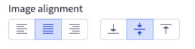
Alignment

Allows you to display alignment controls for your widget. Depending on the use case, you are able to display horizontal, vertical, or both alignments simultaneously.


Widget Configuration Output

{
"contentAlignment": {
"horizontal": "center",
"vertical": "middle"
}
}

Depending on the alignment control type, certain values are possible:

Content alignment settingAllowed values
horizontal”left”, “right”, “center”
vertical”top”, “bottom”, “middle”

User Interface Output

output


JSON Schema

PropertyTypeDescriptionExample
typestringThe type of setting component to display.”alignment”
labelstringThe user friendly message to inform the user how this setting will be used.”Image alignment”
idstringThe variable name where the setting value will be available in the widget template.”imageAlignment”
defaultobjectThe default value to use when rendering the widget for the first time.
default.horizontalstringPossible values include: “left”, “right”, “center”.“center”
default.verticalstringPossible values include: “top”, “bottom”, “middle”.“middle”
typeMetaobjectAdditional information needed based on the selected setting type.
typeMeta.displaystringDetermines which alignment controls are displayed.”both”