Box Model
Allows you to display box model controls for your widget.
Widget Configuration Output
{ "productCardMargin": { "top": { "value": "0", "type": "px" }, "right": { "value": "10.5", "type": "px" }, "bottom": { "value": "0", "type": "px" }, "left": { "value": "10.5", "type": "px" } } }
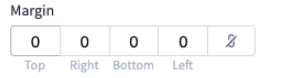
User Interface Output
JSON Schema
| Property | Type | Description | Example |
|---|---|---|---|
type | string | The type of setting component to display. | ”boxModel” |
label | string | The user friendly message to inform the user how this setting will be used. | ”Margin” |
id | string | The variable name where the setting value will be available in the widget template. | ”productCardMargin” |
default | object | The default value to use when rendering the widget for the first time. | |
default.top | object | ||
default.top.value | string | ”0” | |
default.top.type | string | ”px” | |
default.right | object | ||
default.right.value | string | ”10.5” | |
default.right.type | string | ”px” | |
default.bottom | object | ||
default.bottom.value | string | ”0” | |
default.bottom.type | string | ”px” | |
default.left | object | ||
default.left.value | string | ”10.5” | |
default.left.type | string | ”px” |