Lab - Widgets and Page Builder
Plan: Stencil Developer
Lesson 17 of 22 · 45 minIn this lab you will
- GET a Widget Template
- Copy and manage schema data
- Create a new Widget Template
Prerequisites
- BC Sandbox
- API credentials for the store (Content: Modify)
- Postman installed
- Widgets API collection
Get a Widget Template
- Navigate to the ‘Widget Templates > Get’ directory in the ‘V3 Widgets API’ collection in the ‘Collections’ pane on the left side of the Postman window
- Click the ‘Get’ request
The request should look like this:
https://api.bigcommerce.com/stores/{{store_hash}}/v3/content/widget-templates - Delete “/WIDGET_TEMPLATE_UUID” from the end of the request
- Click the Send button
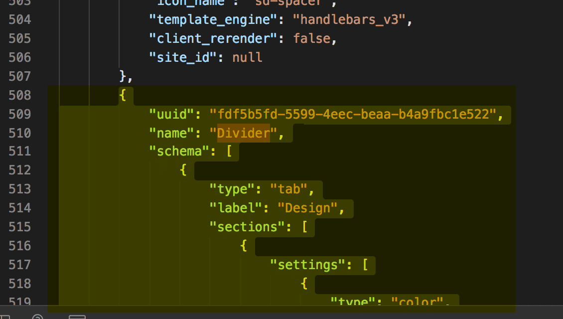
- Observe response and locate the “Divider” widget to be used in next steps.
We will use information from this response to build out the POST request that will create our widget - starting with copying the ‘Divider’ widget as shown below.
Divider examples
{ "uuid": "fdf5b5fd-5599-4eec-beaa-b4a9fbc1e522", "name": "Divider", "schema": [ { "type": "tab", "label": "Design", "sections": [ { "settings": [ { "type": "color", "label": "Line color", "id": "color", "default": "rgba(180, 186, 209, 1)" }, { "type": "select", "label": "Line style", "id": "style", "default": "solid", "typeMeta": { "selectOptions": [ { "label": "Solid", "value": "solid" }, { "label": "Dashed", "value": "dashed" }, { "label": "Dotted", "value": "dotted" } ] } }, { "type": "range", "label": "Line width", "id": "width", "default": 100, "typeMeta": { "rangeValues": { "min": 1, "max": 100, "step": 1, "unit": "%" } } }, { "type": "range", "label": "Line thickness", "id": "thickness", "default": 1, "typeMeta": { "rangeValues": { "min": 1, "max": 10, "step": 1, "unit": "px" } } }, { "type": "alignment", "label": "Alignment", "id": "alignment", "default": { "horizontal": "center", "vertical": "middle" }, "typeMeta": { "display": "both" } } ] } ] } ], "template": "<style>\n .sd-divider-wrapper-{{_.id}} {\n display: flex;\n height: 20px;\n {{#if alignment.vertical '===' 'middle'}}\n align-items: center;\n {{else if alignment.vertical '===' 'top'}}\n align-items: flex-start;\n {{else if alignment.vertical '===' 'bottom'}}\n align-items: flex-end;\n {{/if}}\n {{#if alignment.horizontal '===' 'center'}}\n justify-content: center;\n text-align: center;\n {{else if alignment.horizontal '===' 'left'}}\n justify-content: flex-start;\n text-align: left;\n {{else if alignment.horizontal '===' 'right'}}\n justify-content: flex-end;\n text-align: right;\n {{/if}}\n }\n\n .sd-divider-{{_.id}} {\n height: 0;\n border-top: {{thickness}}px;\n border-color: {{color}};\n border-style: {{style}};\n width: {{width}}%;\n margin: 0;\n }\n</style>\n\n<div class=\"sd-divider-wrapper-{{_.id}}\">\n <hr class=\"sd-divider-{{_.id}}\"/>\n</div>\n", "date_created": "2019-07-31T01:30:01.806Z", "date_modified": "2020-04-07T17:40:32.935Z", "kind": "sd-divider", "storefront_api_query": "", "icon_name": "sd-divider", "template_engine": "handlebars_v3", "client_rerender": false, "site_id": null }
Copy the Divider Widget
- Copy the Divider widget from the previous step (either from the GET response or the divider widget example provided)
- Paste the copied divider widget into the Body section of Postman
- Remove the UUID, schema_translations, and channel_id. (Failure to do so will result in a 422 error)
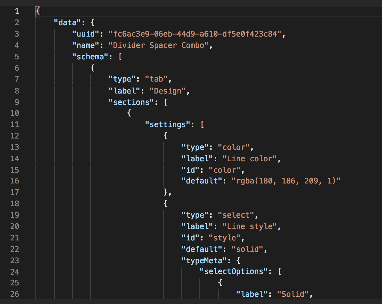
- Change the Name from ‘Divider’ to the desired name for the new widget template. (In the example below we use the name ‘Divider Spacer Combo’)
{ "name": "Divider Spacer Combo", "schema": [ { "type": "tab", "label": "Design", "sections": [ { "settings": [ { "type": "color", "label": "Line color", "id": "color", "default": "rgba(180, 186, 209, 1)" }, { "type": "select", "label": "Line style", "id": "style", "default": "solid", "typeMeta": { "selectOptions": [ { "label": "Solid", "value": "solid" }, { "label": "Dashed", "value": "dashed" }, { "label": "Dotted", "value": "dotted" } ] } }, { "type": "range", "label": "Line width", "id": "width", "default": 100, "typeMeta": { "rangeValues": { "min": 1, "max": 100, "step": 1, "unit": "%" } } }, { "type": "range", "label": "Line thickness", "id": "thickness", "default": 1, "typeMeta": { "rangeValues": { "min": 1, "max": 10, "step": 1, "unit": "px" } } }, { "type": "alignment", "label": "Alignment", "id": "alignment", "default": { "horizontal": "center", "vertical": "middle" }, "typeMeta": { "display": "both" } } ] } ] } ], "template": "<style>\n .sd-divider-wrapper-{{_.id}} {\n display: flex;\n height: 20px;\n {{#if alignment.vertical '===' 'middle'}}\n align-items: center;\n {{else if alignment.vertical '===' 'top'}}\n align-items: flex-start;\n {{else if alignment.vertical '===' 'bottom'}}\n align-items: flex-end;\n {{/if}}\n {{#if alignment.horizontal '===' 'center'}}\n justify-content: center;\n text-align: center;\n {{else if alignment.horizontal '===' 'left'}}\n justify-content: flex-start;\n text-align: left;\n {{else if alignment.horizontal '===' 'right'}}\n justify-content: flex-end;\n text-align: right;\n {{/if}}\n }\n\n .sd-divider-{{_.id}} {\n height: 0;\n border-top: {{thickness}}px;\n border-color: {{color}};\n border-style: {{style}};\n width: {{width}}%;\n margin: 0;\n }\n</style>\n\n<div class=\"sd-divider-wrapper-{{_.id}}\">\n <hr class=\"sd-divider-{{_.id}}\"/>\n</div>\n", "date_created": "2019-07-31T01:30:01.806Z", "date_modified": "2020-04-07T17:40:32.935Z", "kind": "sd-divider", "storefront_api_query": "", "icon_name": "sd-divider", "template_engine": "handlebars_v3", "client_rerender": false, "site_id": null }
Copy the Spacer Schema
Copy the ‘spacer’ schema
- Locate and copy the Spacer Schema from the GET response in step 1 (see example below)
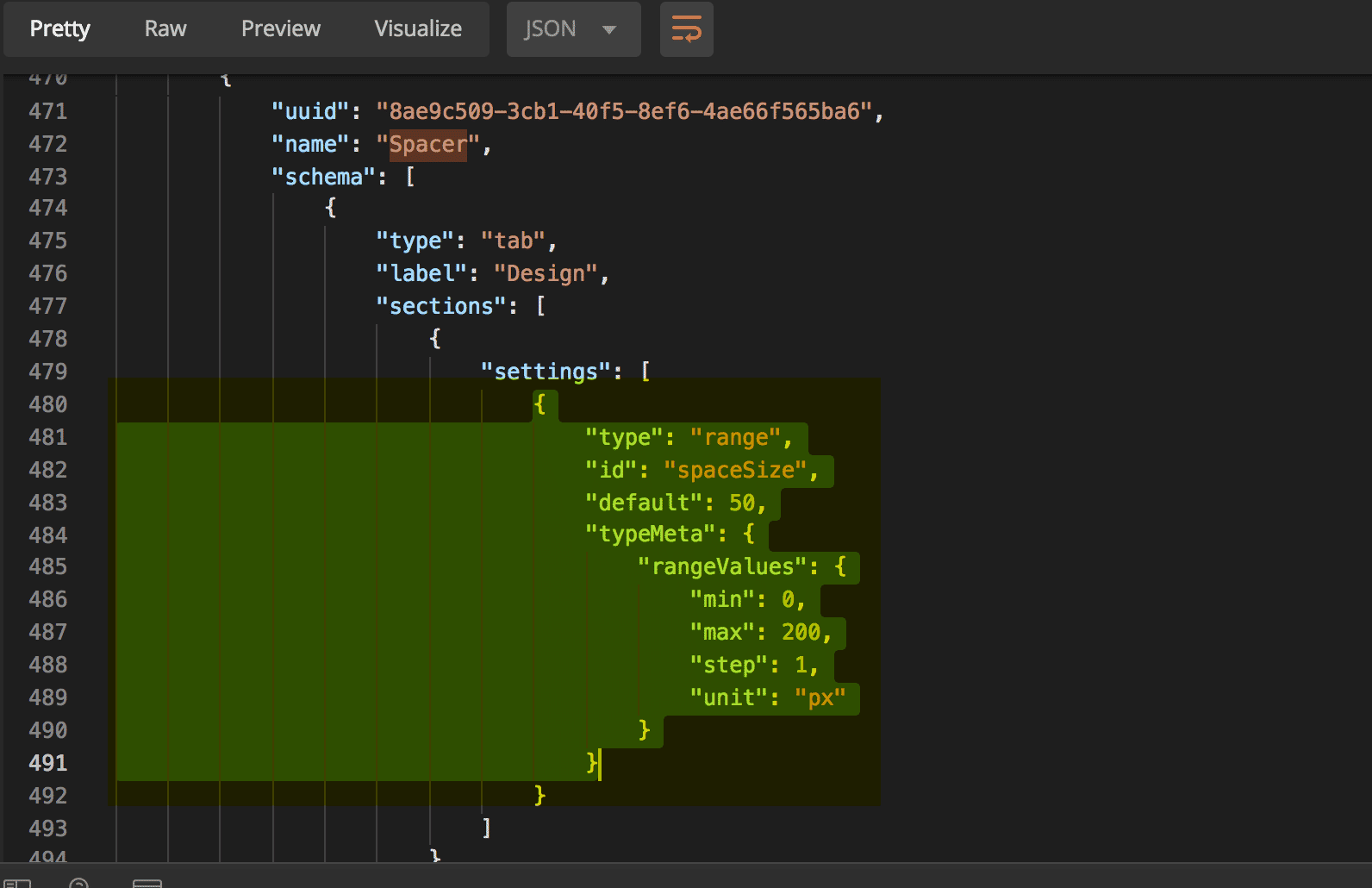
Spacer Schema
Copy the section from the Spacer schema as shown.
{ "type": "range", "id": "spaceSize", "default": 50, "typeMeta": { "rangeValues": { "min": 0, "max": 200, "step": 1, "unit": "px" } } }
- Paste into the Schema array in the body request for the new widget. The schema section of the body request should now look like this:
"schema": [ { "type": "tab", "label": "Design", "sections": [ { "settings": [ { "type": "color", "label": "Line color", "id": "color", "default": "rgba(180, 186, 209, 1)" }, { "type": "select", "label": "Line style", "id": "style", "default": "solid", "typeMeta": { "selectOptions": [ { "label": "Solid", "value": "solid" }, { "label": "Dashed", "value": "dashed" }, { "label": "Dotted", "value": "dotted" } ] } }, { "type": "range", "label": "Line width", "id": "width", "default": 100, "typeMeta": { "rangeValues": { "min": 1, "max": 100, "step": 1, "unit": "%" } } }, { "type": "range", "label": "Line thickness", "id": "thickness", "default": 1, "typeMeta": { "rangeValues": { "min": 1, "max": 10, "step": 1, "unit": "px" } } }, { "type": "alignment", "label": "Alignment", "id": "alignment", "default": { "horizontal": "center", "vertical": "middle" }, "typeMeta": { "display": "both" } }, { "type": "range", "label": "Space Size", "id": "spaceSize", "default": 50, "typeMeta": { "rangeValues": { "min": 0, "max": 200, "step": 1, "unit": "px" } } } ] } } ]
Modify the Divider Template
Modifythe divider template
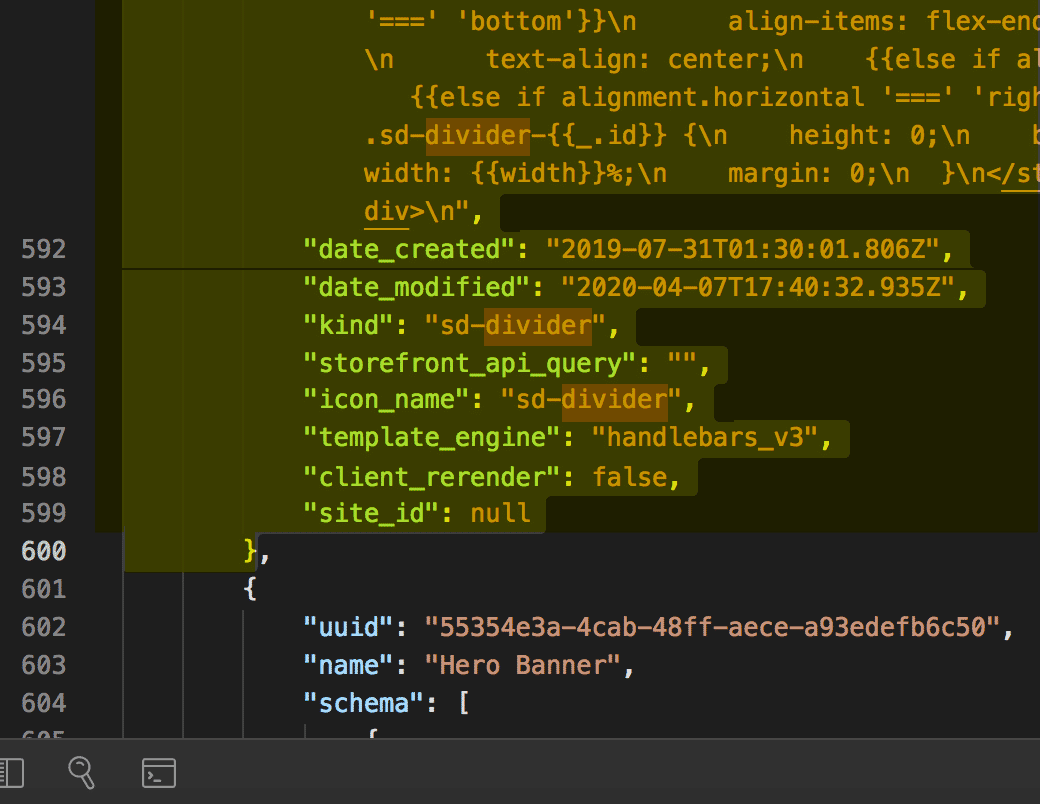
- Copy the template section from the “Spacer” section
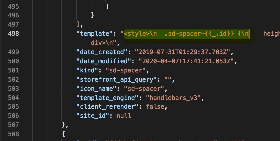
a. Copy between the strings, starting at ”<” and ending at “n”.
- Paste the HTML from this spacer at the start or finish of the “Divider” template section. Example of the updated template below:
"template": "<style>\n .sd-spacer-{{_.id}} {\n height: {{spaceSize}}px;\n }\n</style>\n\n<div class=\"sd-spacer-{{_.id}}\">\n </div>\n <style>\n .sd-divider-wrapper-{{_.id}} {\n display: flex;\n height: 20px;\n {{#if alignment.vertical '===' 'middle'}}\n align-items: center;\n {{else if alignment.vertical '===' 'top'}}\n align-items: flex-start;\n {{else if alignment.vertical '===' 'bottom'}}\n align-items: flex-end;\n {{/if}}\n {{#if alignment.horizontal '===' 'center'}}\n justify-content: center;\n text-align: center;\n {{else if alignment.horizontal '===' 'left'}}\n justify-content: flex-start;\n text-align: left;\n {{else if alignment.horizontal '===' 'right'}}\n justify-content: flex-end;\n text-align: right;\n {{/if}}\n }\n\n <hr class=\"sd-divider-{{_.id}}\"/>\n</div>\n"
Create the New Widget Template
- Copy and Paste the request below into Postman
https://api.bigcommerce.com/stores/{{store_hash}}/v3/content/widget-templates
- Ensure your request body has been formatted correctly. After completing the steps above your body request should look like this:
{ "name": "Divider Spacer Combo", "schema": [ { "type": "tab", "label": "Design", "sections": [ { "settings": [ { "type": "color", "label": "Line color", "id": "color", "default": "rgba(180, 186, 209, 1)" }, { "type": "select", "label": "Line style", "id": "style", "default": "solid", "typeMeta": { "selectOptions": [ { "label": "Solid", "value": "solid" }, { "label": "Dashed", "value": "dashed" }, { "label": "Dotted", "value": "dotted" } ] } }, { "type": "range", "label": "Line width", "id": "width", "default": 100, "typeMeta": { "rangeValues": { "min": 1, "max": 100, "step": 1, "unit": "%" } } }, { "type": "range", "label": "Line thickness", "id": "thickness", "default": 1, "typeMeta": { "rangeValues": { "min": 1, "max": 10, "step": 1, "unit": "px" } } }, { "type": "alignment", "label": "Alignment", "id": "alignment", "default": { "horizontal": "center", "vertical": "middle" }, "typeMeta": { "display": "both" } }, { "type": "range", "label": "Space Size", "id": "spaceSize", "default": 50, "typeMeta": { "rangeValues": { "min": 0, "max": 200, "step": 1, "unit": "px" } } } ] } ] } ], "template": "<style>\n .sd-spacer-{{_.id}} {\n height: {{spaceSize}}px;\n }\n</style>\n\n<div class=\"sd-spacer-{{_.id}}\">\n</div>\n <style>\n .sd-divider-wrapper-{{_.id}} {\n display: flex;\n height: 20px;\n {{#if alignment.vertical '===' 'middle'}}\n align-items: center;\n {{else if alignment.vertical '===' 'top'}}\n align-items: flex-start;\n {{else if alignment.vertical '===' 'bottom'}}\n align-items: flex-end;\n {{/if}}\n {{#if alignment.horizontal '===' 'center'}}\n justify-content: center;\n text-align: center;\n {{else if alignment.horizontal '===' 'left'}}\n justify-content: flex-start;\n text-align: left;\n {{else if alignment.horizontal '===' 'right'}}\n justify-content: flex-end;\n text-align: right;\n {{/if}}\n }\n\n .sd-divider-{{_.id}} {\n height: 0;\n border-top: {{thickness}}px;\n border-color: {{color}};\n border-style: {{style}};\n width: {{width}}%;\n margin: 0;\n }\n</style>\n\n<div class=\"sd-divider-wrapper-{{_.id}}\">\n <hr class=\"sd-divider-{{_.id}}\"/>\n</div>\n" }
- Select POST next to the request url
- Click the Send button
- Observe response
View and Use New Widget in Page Builder
- Navigate to your sandbox store
- Go to Storefront > My Themes > Customize
- Click the Page Builder icon in the left menu
- View the new Widget at the bottom under “Custom”
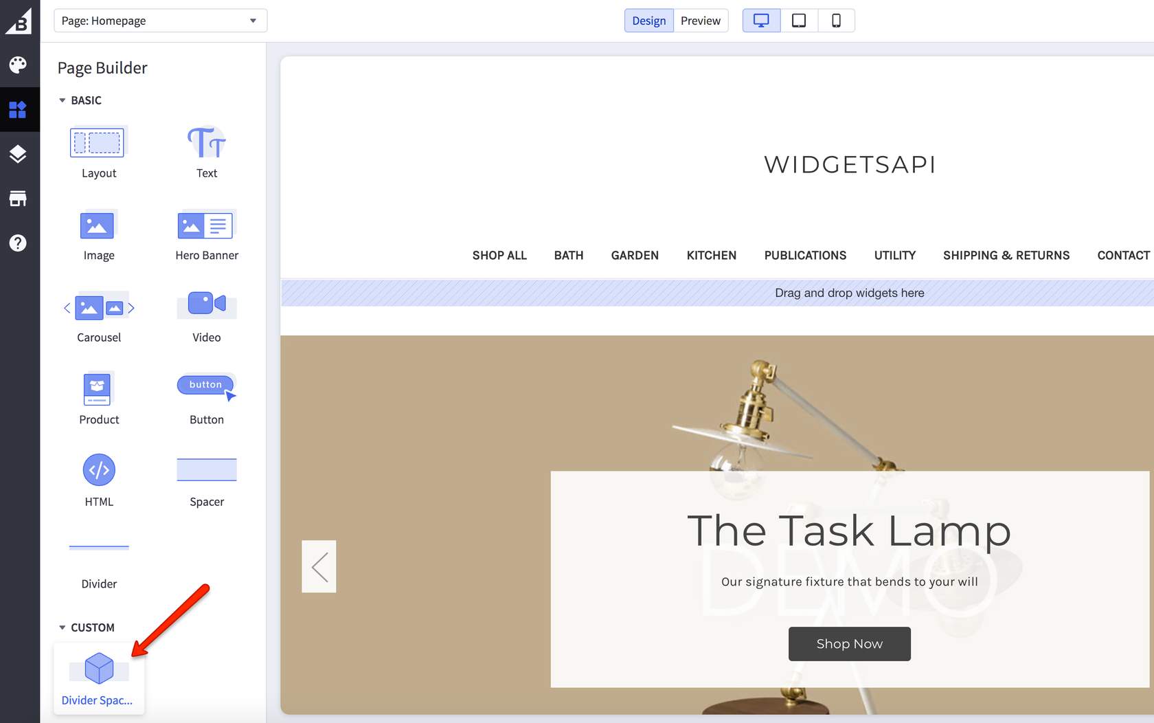
- Drag the new widget into the blue region that says “Drag and drop widgets here”
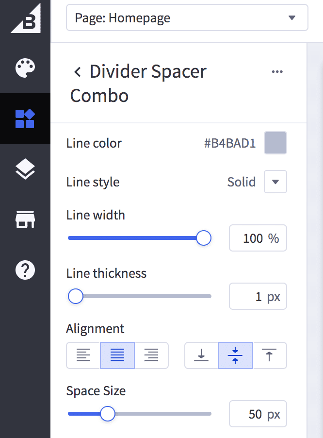
- View Divider and Spacer settings for the new widget
If you have successfully created the widget, it should appear, be available, and work correctly through the Page Builder. If it’s not appearing as expected or you are not able to open Page Builder, please verify that it has been correctly configured.