Built-in Elements
Introduction
With a simple catch-all route integrated as you’ve seen in previous lessons, it’s easy to give content authors full control to build every part of their custom pages within the Makeswift editor.
However, in enterprise web sites, particularly in applications like ecommerce that deal with significant dynamic data, the use case is often more complex. It is not necessarily practical or even helpful to make all types of pages fully “buildable.” For example, building every product page in an ecommerce site individually within the Makeswift editor might offer flexibility, but this would actually put an undue burden on content authors in contrast with a templated page, as well as leaving more room for inconsistency between similar pages.
In such use cases, it’s appropriate for certain aspects of layout to remain in the purview of the application code. But even in these scenarios, you will usually want to give content authors editing flexibility within certain constraints. This can be accomplished with built-in elements.
Recall that the instances of components that authors drop into the visual editor’s canvas are referred to as elements. Built-in elements are a form of the same concept in which a component is inserted into a page’s layout by code instead of within the builder. This provides a more targeted, controlled option for including editable components as compared with the full “page snapshot” approach.
Using this technique gives you nearly limitless flexibility for interleaving code components with editable properties and slots, ensuring you can truly leverage the power of Makeswift however you want, wherever you want.
Using MakeswiftComponent
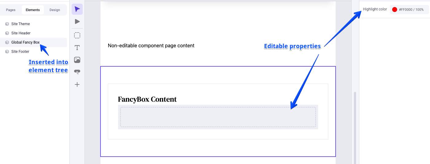
MakeswiftComponent is used in combination with the client method getComponentSnapshot to place a specific registered Makeswift component as an element within a layout, all within code. A component included in this way is selectable, and its props fully editable, within the Makeswift editor like any other component instance.
As an example, let’s start with a simple component registered with the runtime like normal:
This component can not only be used directly in the Makeswift editor in typical fully buildable pages, but can also be placed directly within an in-code component structure with MakeswiftComponent.
With the element created in this way, when editing a page in which the component appears, it will be selectable within the canvas, and its props can be edited like any other component, including the use of editing Slots that have been rendered. The configuration and content provided via the props will apply wherever the component appears.
- The registered component to be placed is determined by the type property, which must match the type of a component registered with the Makeswift runtime.
- MakeswiftComponent makes use of a component snapshot obtained with getComponentSnapshot using a unique ID. In contrast with page snapshots, this means the “instance” of the component being edited within the Makeswift canvas is tied only to that unique ID, not to a URL path. This makes it possible to edit and display the same component instance on multiple pages.
- The label provided to MakeswiftComponent will appear in the hierarchy in the Components panel of the editor.
In our simple example, a static value has been provided for the ID of the component snapshot and the label of MakeswiftComponent. This essentially makes the component a global section, meaning the content configured for it on any page on which it appears will affect the component on all pages, since the ID will always be “global-fancy-box”.
By contrast, it’s possible to include a dynamic string, such as an ID from a dynamic page route, in these values to limit the scope of each component snapshot.
Used in combination with the ability to edit a page directly by entering a URL in the editor location bar, this gives you the power to edit the component’s properties individually for every page record, since each will have its own unique component snapshot.
Hidden Components
By default, registering a component with the Makeswift runtime makes it available in the editor component tray. With the possibility of placing components in code, it’s a valid scenario to have a component you intend only for use in this way, not for typical layout building.
Use the hidden property when registering a component to exclude it from the component drawer.
This component will not be available to drag and drop new instances within the editor but can still be used with MakeswiftComponent.
The Wrapper Component
Like the Page component, Component in lib/makeswift/component.tx is a shorthand way of wrapping the jobs of loading a component snapshot and rendering it. Component takes a label, snapshot ID, and component type all in one set of props, so the previous example could be simplified to the following:
Editable Regions with Slot
One of the simplest and most common scenarios for built-in elements is to inject regions for free-form editing in the builder into specific locations within your page layouts. This is essentially equivalent to creating and registering a component with a single prop mapped to a Slot control.
This is such a common use case that the Makeswift runtime offers a dedicated Slot component (not to be confused with the Slot control itself) that can be used with a component snapshot to insert such an editable region.
Slot accepts a fallback prop defining the content that will be displayed until the “Use fallback” property is un-checked in the editor interface.
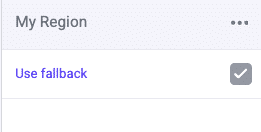
If you decline to render a fallback, as is a common use case, note that your slot element will not initially be visible within the Makeswift builder’s canvas! This simply means you will need to locate your element in the Elements panel in order to un-check “Use fallback” and utilize your editable slot.
Mixing Prop Sources
In the simplest implementations as shown above, all of the props for built-in elements are provided by the editor interface, just like any other Makeswift component.
On the other end of the spectrum, you may have a use case for embedding your components directly in code along with the values of all their props. In this case, there’s no need for MakeswiftComponent or the concept of built-in elements at all. Remember, registered components are just React components with props; you can use them directly in code, providing prop values as normal.
The more complex use case comes when you only want to expose some of a component’s props with Makeswift controls, while providing values for other props in code. In a very simple scenario, you might choose to register versions of the component with hard-coded props, which could then be used directly with MakeswiftComponent, such as in this example registration with two hard-coded color values:
Data from Server Components
In a more complex situation, you may need to provide prop values at the point where the element is placed. A common use case would be when dynamic data is loaded by a React Server Component.
As an example, consider a component that takes several props for styling and “extra content,” but also a cards prop that expects a specific schema.
In our use case, you want to embed FancyBox directly as a built-in element, making most of the props editable in the Makeswift builder, but cards will be populated by data loaded in a Server Component.
In this case, what’s needed is an intermediary component with the correct props to map to Makeswift controls, but with a different mechanism to provide the other prop. This example creates a React context provider for that purpose:
The new MakeswiftFancyBox, with its three props, can now be registered separately with the runtime:
Notice that hidden has been set to TRUE for this component. With its reliance on a React context provider instead of a prop control for the cards data, it’s probably not suitable for direct use in the editor component tray.
Now in the appropriate place in the site layout, this intermediary component can be referenced with MakeswiftComponent to take care of the editable props, while also utilizing the context provider to supply the dynamic data:
In Catalyst
In the default Makeswift integration with Catalyst, there are a number of components placed using built-in elements.
Components with Server-Side Data
Several Catalyst built-in elements are implemented according to the basic “hybrid” example pattern above. These components provide selective editing capability with Makeswift in areas where context is also supplied by the custom routes and/or data fetching.
Let’s look at the ProductDetail section component, used for the layout and interactivity of the main product detail page content. Examine the following files in your own Catalyst codebase.
- vibes/soul/sections/product-detail/index.tsx: This generic component is the main UI implementation, exposing simple props for various data.
- lib/makeswift/components/product-detail: The files located here are related to enabling Makeswift capabilities.
- app/[locale]/(default)/product/[slug]/page.tsx: The component code that ultimately includes the presentation on the page is located in the product detail page route.
Within the lib/makeswift/components location referenced above, you’ll find the following files:
- client.tsx: This contains the implementation of the intermediary component that gets registered with the Makeswift runtime. This component defines the appropriate React context provider and ultimately passes props to the basic ProductDetail component.
- register.tsx: This contains the actual registration of the component defined in client.tsx, providing the appropriate editor controls.
- index.tsx: The React Server Component defined here takes care of the main strategy of orchestrating the React context provider with MakeswiftComponent and a component snapshot.
With the implementation encapsulated within these files, the server component exported by lib/makeswift/components/product-detail/index.tsx is all the product detail page route needs to be concerned with, simply passing in the appropriate dynamic data as props.
These conventions are used consistently throughout Catalyst for similar Makeswift capabilities in various areas.
Site Theme
The Site Theme component we’ve previously explored is placed using a built-in element. This accounts for its presence in the Elements panel of the editor interface.
While this component does not rely on data loaded in an outside React Server Component, you can see from its structure in lib/makeswift/components/site-theme that it follow the same conventions as other built-in elements, including separate index.tsx and client.tsx files.
As with other built-in elements in Catalyst, this structure abstracts the process of placing the component with MakeswiftComponent and a snapshot, so that app/[locale]/layout.tsx only needs to be concerned with importing a single SiteTheme server component.