Lab - Theming
Introduction
In this exercise, we’ll pick up where we left off with our Overview UI, exploring available options for global theming of Material UI components.
In this lab, you will:
- Create custom configuration pulled into the Material UI theme
- Apply a custom font
- Modify various component styles
Setup
This exercise continues where you left off previously. Make sure the dev server is started in your Buyer Portal project:
If you need a fresh start, you can follow the instructions below to set up a new project complete with previous exercise code.
- Copy the project with the appropriate tag.
- Install dependencies.
- Run the dev server.
Remember!
Script Manager in your store control panel must contain appropriate header/footer scripts to load the Buyer Portal from your local environment on the appropriate port.
Revisit the initial setup lab for full details on setting up your environment.
Exercise Reference Copy
If it’s helpful to compare your own code as you go, you can clone or download the completed version of this labs as a reference.
The Material UI Theme
Remember, all file paths referenced in these exercises are relative to apps/storefront/src in your Buyer Portal project.
The Material UI default theme we’ve previously seen controls styles for all Material UI components in your application. We’ve already seen how theme values from this schema can be applied in a specific context. When these values are changed in the theme, all relevant components are affected.
Overriding the default theme with your own values involves the use of createTheme and a ThemeProvider as described in the documentation.
The Buyer Portal already implements just such a provider in theme.tsx, to faciliate the custom primary palette color and default background color. In this exercise, we’ll update this code to merge in config from a separate file, where we can cleanly implement any custom theme values we wish to apply.
Step 1: Apply Custom Theme Config and a Font
Our boilerplate code already includes a file with a getThemeConfig function, which we’ll flesh out in this step. First, we need to update the Buyer Portal’s Material UI theme config to include this output.
- Open
theme.tsxand add an import for thegetThemeConfigfunction.
- Update the
themefunction that returns the Material UI theme. Our goal is to runcreateThemetwice now, once with the values the Buyer Portal already provides and another with our custom config.
Don’t forget to include the explicit opening and closing curly braces we’re introducing to the function.
- Open
theme-config.tsand add a return value as shown.
We’re accepting the initial theme configuration as an argument and using it to set the same palette values already provided, preserving the Buyer Portal’s native functionality.
Changing the Font
Let’s utilize the Material UI theme to change the default font used throughout components. We’ll use the Google Font Montserrat, which is the default font of the Cornerstone theme.
First, we need to make sure the font is being loaded. There’s a constant for this primary font URL in App.tsx.
- Open
App.tsxand updateFONT_URL.
- Open
theme-config.tsand add the appropriate typography configuration.
Navigate to the Buyer Portal in your storefront and verify that the new font is applied throughout the UI.
Step 2: Expand Theme Config
Now that there’s a clean configuration for overriding Material UI theme values, let’s try modifying a few more color and typography styles.
- Open
theme-config.tsand add values as shown.
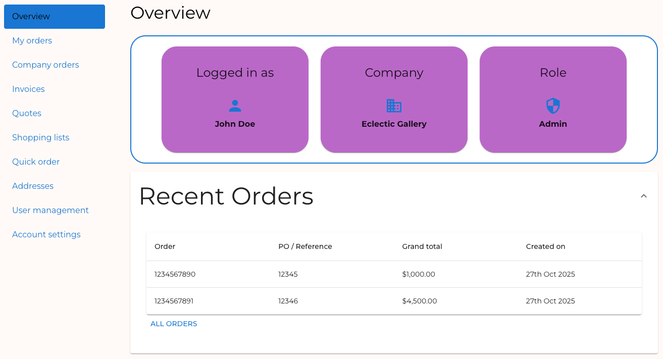
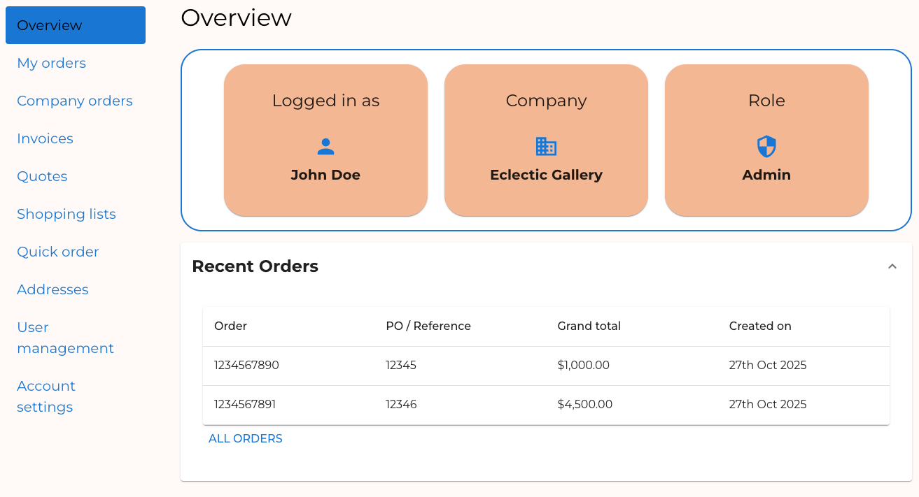
Recall that the “secondary” color in the Material UI palette is the color we applied to the background of the “Identity” cards. These should now reflect our new value. The typography changes should be evident in headings, body text, and buttons throughout the Buyer Portal.
Before:
After:
Feel free to experiment with other values for the theme config.
Step 3: Apply Component Theming
As you can see, the Material UI theme schema consists of broadly applicable values, like a general color palette and generic font sizes/weights.
This broad config is very valuable for ensuring that there’s a consistent look and feel across components. However, the theme configuration also allows us to get much more granular, making it possible to declare things like “what a ‘contained’ button looks like” in the theme itself.
In this step, we’ll apply this kind of component-specific theming in a few areas.
- Open
theme-config.tsand add values as shown.
We’re declaring theme values for Accordion, Button and IconButton components. The keys used to identify each component (such as MuiButton) are detailed in the Component API documentation (such as this example for Button).
The code above demonstrates two aspects of component theming:
defaultPropscan be used to set the default value of any prop the component accepts. See the “Props” section of the component API documentation.styleOverridessets CSS styles for the component. Note the sub-keyrootin theMuiButtonconfig. This corresponds the.MuiButton-rootclass that styles the root element. Components consist of multiple parts and variations, and other keys can be used in the same way to target these. For example, thecontainedkey can be used to provide styles corresponding with the.MuiButton-containedclass. See “CSS classes” in the component API documentation.
Revisit your Overview page to see the effects on the Accordion and Button components.
The IconButton component can be seen in action on the “User management” page, where “edit” and “delete” icons appear for each user.
Full Exercise Code
Taking It Further
- Explore the Material UI theme configuration and expand
theme-config.tswith additional values. - In the Component API documentation, review the available CSS classes for other components in the Buyer Portal, such as
Box,Card,Grid, andTable. Incorporate component-specific styles into your theme config. - Review the documentation for creating themed components and try building your own component that can be styled with theme configuration.