Component Structure
Introduction
Building React applications is all about a structure of components composed together into a page layout. Let’s explore the most common component conventions used in the Buyer Portal.
Material UI
Material UI (MUI) is a popular open-source React component library. This library provides the core building blocks for the Buyer Portal. For example:
- Layout (
Box,Grid) - Surfaces (
Card,Paper) - Data display (
Table,TableRow,TableCell) - Inputs (
TextField,Checkbox,Select) - Feedback (
Dialog,Snackbar) - Icons (
KeyboardArrowDown,DataUsageRounded)
Look for components imported from @mui/material and @mui/icons-material to explore the use of Material UI throughout the app.
Theming in the Control Panel
You should be familiar with the free-form “CSS Override” field in the Buyer Portal settings within your control panel:
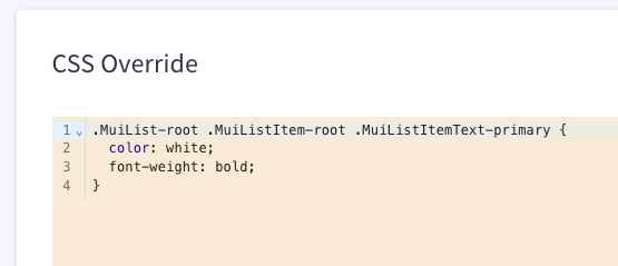
When your theming needs are lightweight, this control panel option can be used to apply styles without touching code. A good familiarity with the system of CSS classes used by Material UI will help you make such styling effective.
For example, see the API documentation for the Button component, which itemizes CSS classes like .MuiButton-root (which affects the root button element) and .MuiButton-contained (which affects only buttons where the variant prop is set to contained). The documentation includes exhaustive CSS class references for all components.
Theming in Code
A good developer experience for React components must include easy and robust style-ability. Material UI supports a number of options for styling components, from simple one-off styles to a full theme system.
sx: This prop is supported by all Material UI components and is used to apply free-form inline styles.styled: This utility allows you to decorate an existing component with additional styling, resulting in a reusable “styled” version of the component.- Theme: Global theme values control key aspects of the look and feel of all components. This theme system allows style changes to be applied globally and consistently. Both
sxandstyledalso support direct references to theme values, making their values dynamic and subject to the central theme configuration.
We’ll be using all three of these strategies in hands-on labs.
Control Panel Styles
In addition to the free-form “CSS Override” setting mentioned above, several other aspects of the look and feel of the Buyer Portal can be controlled in the B2B Edition settings of the store control panel. (For example, the Buyer Portal’s primary and background colors.) Examine the following in the project to understand how these are applied:
CustomStyleContextis a piece of React context used to store these values. It includes adispatchfunction that can be used to update the values.App.tsxretrieves thisdispatchfunction and passes it togetStoreConfigs.getStoreConfigsmakes the appropriate GraphQL API request to fetch the store’s configuration and uses thedispatchto set these values.- Components throughout the app use
CustomStyleContextto retrieve the values and set styles on an individual basis.
Buyer Portal Components
A number of key components are unique to the Buyer Portal. These are usually located in src/components/ and usually have a B3 prefix. The following are just a few of the most common.
Layout and Theme
B3Layout/B3MobileLayout: Main app shell when the user is logged in. They compose header, navigation, and content area; the mobile variant adjusts layout for small screens.B3Nav,B3MainHeader,B3Logo,B3AccountInfo: Building blocks for the top bar and sidebar (e.g. logo, nav links, user/account info).ThemeFrame: Wraps the main router/content in the app, applies global styles and font configuration, and renders the actualiframethe Buyer Portal is located in.
Tables
B3Tableis built on the MUITablecomponent pattern and supports rendering of lists of records. We’ll examine this more closely in the next lab.B3PaginationTablewrapsB3Tableand manages data fetching and pagination state. Callers pass agetRequestListfunction andsearchParams; the component handles loading, page changes, and optional “select all” across pages.
Data and feedback
B3Dialogis built on MUI’sDialogand supports standard actions (e.g. Cancel / Save) or custom actions.B3Spinis a loading indicator used during async operations.
Forms and filters
B3Control*components (B3ControlTextField,B3ControlSelect,B3ControlCheckbox, etc.): Form controls that wrap MUI inputs and hook into the app’s form and validation patterns.B3Filter,B3FilterSearch,B3FilterPicker,B3FilterMore: Reusable filter UI used on list pages (e.g. orders, quotes) to build search and filter params.